Page 2 of 2
Re: the Artwork - keep it Black, White and BOLD!
Posted: Fri Jun 10, 2011 8:32 am
by GnomeBoy
On the topic of the art, has anyone else caught the 'continuity' of the piece on page 6? We've certainly seen these treasure seekers before...

Re: the Artwork - keep it Black, White and BOLD!
Posted: Sat Jun 11, 2011 11:57 am
by Troy812
All the artwork is just a bunch of delicious nuggets of old time gaming! Yum Yum!
...and unlike most RPG art these days... it really inspires me to play. Just looking at the black and white line art just gets my creative juices flowing.
T
Re: the Artwork - keep it Black, White and BOLD!
Posted: Sat Jun 11, 2011 12:07 pm
by stefan
GnomeBoy wrote:We've certainly seen these treasure seekers before...
Good eye!
Re: the Artwork - keep it Black, White and BOLD!
Posted: Sat Jun 11, 2011 3:32 pm
by GnomeBoy
stefan wrote:Good eye!
It's the right one.
The guy with the torch commanded my attention, and then I was all "heeeeyyyyyyyy...". Sweet bit of work.

Re: the Artwork - keep it Black, White and BOLD!
Posted: Sat Jun 11, 2011 10:07 pm
by Treebore
I agree that the B/W art is the shiznet. Definitely keep it, as it is one of the bigger draws to this RPG for me. I may very well be buying this book just because the art is so cool, and very possibly never play the RPG. Wouldn't be the first time I've done that, and probably wouldn't be the last time.
Re: the Artwork - keep it Black, White and BOLD!
Posted: Sun Jun 12, 2011 5:57 pm
by goodmangames
I'm a big fan of old-school art (obviously) and DCC RPG is a chance for me to express that.
Some of the current layout decisions are indeed dictated by the incomplete state of the text (e.g., the random pics around the spells)...that will be corrected in the final layout (when those images have a proper place to go, and the final spell art is in house).
The final hardback will retain the emphasis on B/W interior art, while also adding full-color art on the back cover (Hugh the Barbarian, as referenced in another thread) and endsheets (different front and back, one by Peter Mullen and one by Doug Kovacs). Peter Mullen just turned in his endsheet painting and it turned out great.
I am very excited to eventually show everyone the art for the modules. In addition to the module art previewed at the end of the beta rules, Doug has finished more and is working on additional covers. The module titles, covers, and themes are inspired by pulp-era fantasy. I believe the modules will "seal the deal" on what DCC RPG has to offer from several angles, including art. But that's a topic for a few months from now.
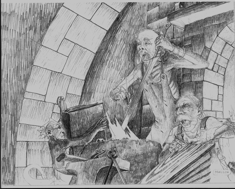
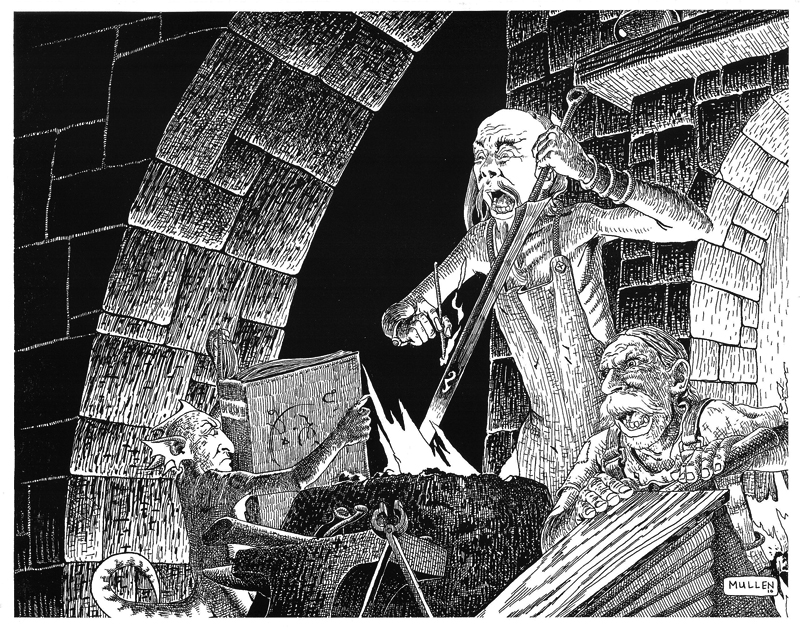
Random side note: Peter Mullen can do anatomically accurate drawings (e.g., correct proportions and less cartoony style). We've gone through several styles in preparation for this book. Interestingly, his pencil sketches actually look like a completely different artist, as he does them "realistically" and then "stylizes" them in the inking. It's a style choice, not a question of ability.
Hmm, digging through my files, here's one "before" and "after" I happen to have handy. Not all artists appreciate this kind of "behind the curtain" revelation of process/style so apologies in advance to Peter if this is not to his liking, but I think it's worthwhile in the context of this thread.
In reference to the image on page 112 of the beta rules, here is Peter's sketch and the final. In particular, note the character in the bottom right. The sketch isn't finished, obviously, but you can see how the face of that character was moving in the direction of being almost a realistic portrait, before changing in the inking to the more stylized fantasy style.
Re: the Artwork - keep it Black, White and BOLD!
Posted: Sun Jun 12, 2011 6:41 pm
by chokehazard
I like the black & white interior artwork and would like to see it kept. It really sets the mood for the game as a whole.
Re: the Artwork - keep it Black, White and BOLD!
Posted: Sun Jun 12, 2011 7:17 pm
by Lennon V. C.
I for one love Mullen's stylized art. I stared at page 25 for a good 5 minutes last night.
I could do without the cartoons. They are funny and cool, but I just don't think they fit in theme of the book.
Keep it a color cover with black and white interior.
Re: the Artwork - keep it Black, White and BOLD!
Posted: Sun Jun 12, 2011 9:17 pm
by goodmangames
Yeah, that image on page 25 is one of my all-time favorites. I did the same stare-fest when I first got it. There's so much cool stuff there to look at.
Re: the Artwork - keep it Black, White and BOLD!
Posted: Mon Jun 13, 2011 7:17 pm
by Lennon V. C.
I love the fully black chapter intro, but could GG change it to white for the beta. That is a lot of toner when I print.
Re: the Artwork - keep it Black, White and BOLD!
Posted: Mon Jun 13, 2011 8:08 pm
by Harley Stroh
[Begin Fan Rant]
Ha! The image on page 53 has been haunting me for months. I haven't been able to place that rogue, but I knew I'd seen him in a picture somewhere (up on somebody's shelf).
Finally came to me tonight:

I've always loved this image, and even built characters after the rogue/ranger in green, down to the short sword and the two-handed blade he keeps around for "situations." If I'm right (and I could be wrong) this is a great tribute to Parkinson, perhaps my favorite of the TSR artists. And it speaks to ability of Tom Galambos to capture a "character" seen once, in a different pose, in a different scene, 20 years ago.
Whew.
I need to see if Tom will part with the test sketch.
Man, I miss Parkinson.
[/End Fan Rant]
//H